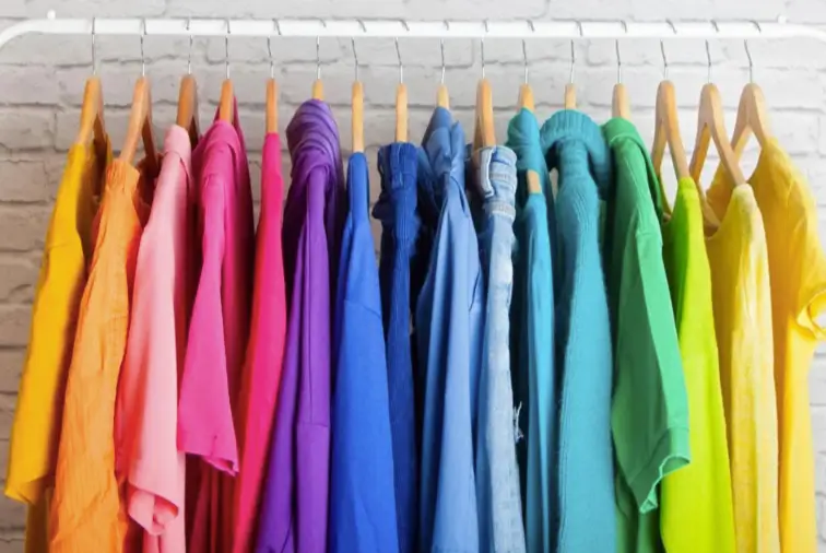
Think about the last time you stood in front of your closet and reached for something without really deciding. Chances are the choice had less to do with logic than with a feeling. Some mornings call for something soft and calm. Others call for a color that helps you feel switched on.
That instinct is what color psychology is about. It won’t tell you exactly what to wear, but it helps explain why certain shades feel right on certain days, and how to choose clothing with more intention.
What Color Psychology Actually Means
Color psychology looks at how colors influence mood, perception, and behavior. It’s worth being honest about its limits, though. Research in this area is mixed, and much of what we feel about color comes from personal memories and cultural background rather than universal rules.
White, for example, suggests weddings in some cultures and mourning in others. A shade that feels cheerful to one person may feel loud to another. So treat color psychology as a set of common tendencies, not fixed laws. It’s a useful lens, not a script.
Why Color Affects What We Wear
Clothing sits close to the body and is seen by others all day, so color carries a double role. It affects how we feel in our own clothes, and it shapes the impression we make.
Most people sense this without naming it. A crisp, light shirt can feel fresh and organized. A deep, dark layer can feel protective and composed. A bright accent can lift a flat morning. These reactions are subtle, but they add up in daily choices.
Common Associations Behind Popular Colors
These associations are widely shared in many Western markets, though they vary by person and region.
Blue: Calm and Trust
Blue is often linked with steadiness, reliability, and calm. That’s one reason it appears so often in workwear and everyday basics. Lighter blues tend to feel relaxed, while navy feels more serious and composed.
Black: Control and Polish
Black is commonly tied to sophistication, authority, and minimalism. It’s a popular choice when people want to feel put together with minimal effort, or when they want to be taken seriously.
White and Cream: Clarity and Freshness
Light neutrals suggest cleanliness, simplicity, and openness. They tend to feel fresh and bright, especially in warmer months.
Red: Energy and Confidence
Red is associated with energy, passion, and attention. People often reach for it when they want to feel bold. It’s also a color that’s easy to overdo, which is why it usually works best as a single statement piece.
Green: Balance and Calm
Green, especially in muted olive and sage tones, is tied to nature and balance. It often feels grounding and restful.
Yellow and Orange: Warmth and Optimism
Warm, bright shades feel cheerful and approachable. They add energy but can be intense in large amounts, so many people prefer them as accents.
Grey and Earth Tones: Stability
Grey, brown, tan, and olive tend to feel steady and unpretentious. They suit people who want comfort and ease without much visual noise.
How Mood and Occasion Shape Color Choices
People rarely choose clothing color in a vacuum. The situation matters.
- Work or important meetings: many people lean toward navy, grey, or black for a composed look.
- Relaxed weekends: softer, earthier shades often feel more natural.
- Social events: brighter or more expressive colors come out.
- Low-energy days: familiar, comfortable neutrals can feel easier than bold options.
This also explains why a flexible wardrobe needs more than one mood. Having calm, bold, and neutral options lets you dress for how you feel without buying something new each time.
Using Color Psychology Without Overthinking It
You don’t need to analyze every outfit. A few simple habits are enough.
- Notice what you reach for. Your most-worn colors reveal what makes you feel comfortable.
- Match color to the day. Try a calm shade before a stressful meeting, or a brighter one when you want a lift.
- Start with one accent. If you rarely wear bold colors, a single piece is a low-risk way to test how it feels.
- Stay honest about fit. A flattering color in an uncomfortable cut still feels wrong. Comfort comes first.
What This Means for Brands and Retailers
For anyone building a collection, understanding color associations helps with planning, but it shouldn’t replace listening to customers. Associations are tendencies, and your audience may respond differently.
A useful approach is to cover several moods within one range. Keep calm, versatile neutrals as the foundation, add a few shades that suggest warmth or comfort, and reserve bolder colors for limited drops.
Blue is often a dependable middle ground, since it feels calm and familiar while pairing with the denim most customers already own. In a basics range, a wholesale blue sweatshirt in navy or a muted mid-tone gives shoppers a relaxed, easy-to-style option that suits both casual days and slightly dressier settings.
Clear color names also help. Words like slate, oat, or moss give customers a sense of the mood before they see the garment, and they make it easier to imagine how a piece fits into their routine.
Color Only Works When the Garment Does
Psychology can nudge a customer toward a color, but quality decides whether they keep wearing it. A calm blue that fades after a few washes or a warm brown that looks patchy stops feeling comforting very quickly.
Pay attention to fabric weight, dye consistency and stitching, and wash-test samples several times before ordering in bulk. Compare shades in natural light, since colors can shift between warm and cool depending on the setting.
It also helps to review a few suppliers side by side when sourcing basics. A catalog such as Simplstc Apparel can give you a sense of the fabric weights, cuts, and color options available before you decide what suits your needs. Whichever source you choose, ask about color consistency between production runs, because a restock in a slightly different shade changes the feeling of a range.
Test Rather Than Assume
Because color responses vary, the best way to learn what works is to test.
- Release new shades in small batches.
- Watch which colors customers reorder or share in photos.
- Ask for feedback on both color and fit.
- Adjust future drops based on what people actually wear, not just what theory suggests.
Conclusion
Color psychology helps explain why we reach for certain shades, but it works best as a guide, not a rulebook. Calm tones can steady a busy day, bold tones can lift a quiet one, and neutrals keep everything easy.
For wearers, that means noticing what makes you feel good and building a wardrobe around it. For brands, it means offering a balanced range, backing it with quality fabric and letting customers show you which colors they connect with. The best color choice is the one someone wants to put on again.